News A new Blue Marble

earth.jpg


The photo is called the Blue Marble 2012, you can get it in high resolution here.
 
I was just discussing this with a friend yesterday. The issue is that the "photo" was taken by NPP, which is in sun-synchronous orbit at 825 km. You can't see all of that from 825km in one frame, although it doesn't represent Blue Marble distance either. (In orbiter, I estimated the height need to see all that landmass at one time to be 2000-4000 km).

Sure enough, I went to the NASA website and found this:
http://jointmission.gsfc.nasa.gov/science/sciencecollection.html

This composite image uses a number of swaths of the Earth's surface taken on January 4, 2012.

My question is, how did they get the clouds to line up so well? I would think there should be some noticeable boundaries between passes as clouds moved slightly, but there appear to be none...:hmm:
 
It kinda bugs me that most sources seem to not realize that it's a composite image, or only state it fairly far down in the article...
 
Doesn't it look a bit... odd? The landmasses look out of proportion, almost like it is taken through a fish-eye lens. Is this Hemisphere Bias at work? :uhh:

Compare with a screenshot from Orbiter:
attachment.php
 
Last edited:
Doesn't it look a bit... odd? The landmasses look out of proportion, almost like it is taken through a fish-eye lens. Is this Hemisphere Bias at work? :uhh:

Compare with a screenshot from Orbiter:
attachment.php

Because they did a pretty poor job of applying the composite image onto a sphere... I can't help but think they wanted to make north america look big on purpose, though.
 
Because they did a pretty poor job of applying the composite image onto a sphere... I can't help but think they wanted to make north america look big on purpose, though.

To me it almost looks like a panoramic photograph, all distorted like that. I actually like the old Blue Marble better:

Apollo17WorldReversed.jpg

The one, the only
:cheers:
 
Last edited:
Yeah, I don't like this image. Please don't shove North America in my face; It looks better when it isn't inflated.

Nothing can beat the actual Blue Marble:
480px-Apollo17WorldReversed.jpg
 
Yeah, I don't like this image. Please don't shove North America in my face; It looks better when it isn't inflated.

Nothing can beat the actual Blue Marble:
480px-Apollo17WorldReversed.jpg

You sure you don't like it because your in the center of it!:lol:
 
We need some more actual photos of the whole Earth. The Apollo Blue Marble has monopolized this area since there are barely any other pictures like it. Instead, we have to deal with CGI pictures. Sure, some look good, but one would think that after all this time someone would go through the trouble to take more actual pictures. I'm getting tired of the same old blue marble. Hey NASA, ESA, or Roscosmos, send up a satellite or use an existing one, but for the love of the probe, give us something!
 
You sure you don't like it because your in the center of it!:lol:

Actually, Madagascar is in the center... but it is pretty cool for Southern Africa to be so predominantly featured.

But hey, I do not like pictures of my home planet just because they show the location of my home country. :P

640px-The_Water_Planet.jpg


That's the Pacific, with California and the Baja peninsula to the right limb.

(Apparently this image is constructed from MODIS data, but it's definitely a much better picture than BalloonAmerica.)
 
Also, consider that on so many maps Europe is put in the center. Europe has been just as guilty as North America of making their continent look bigger or more important. Heck, I'll bet this is done on every continent.
 
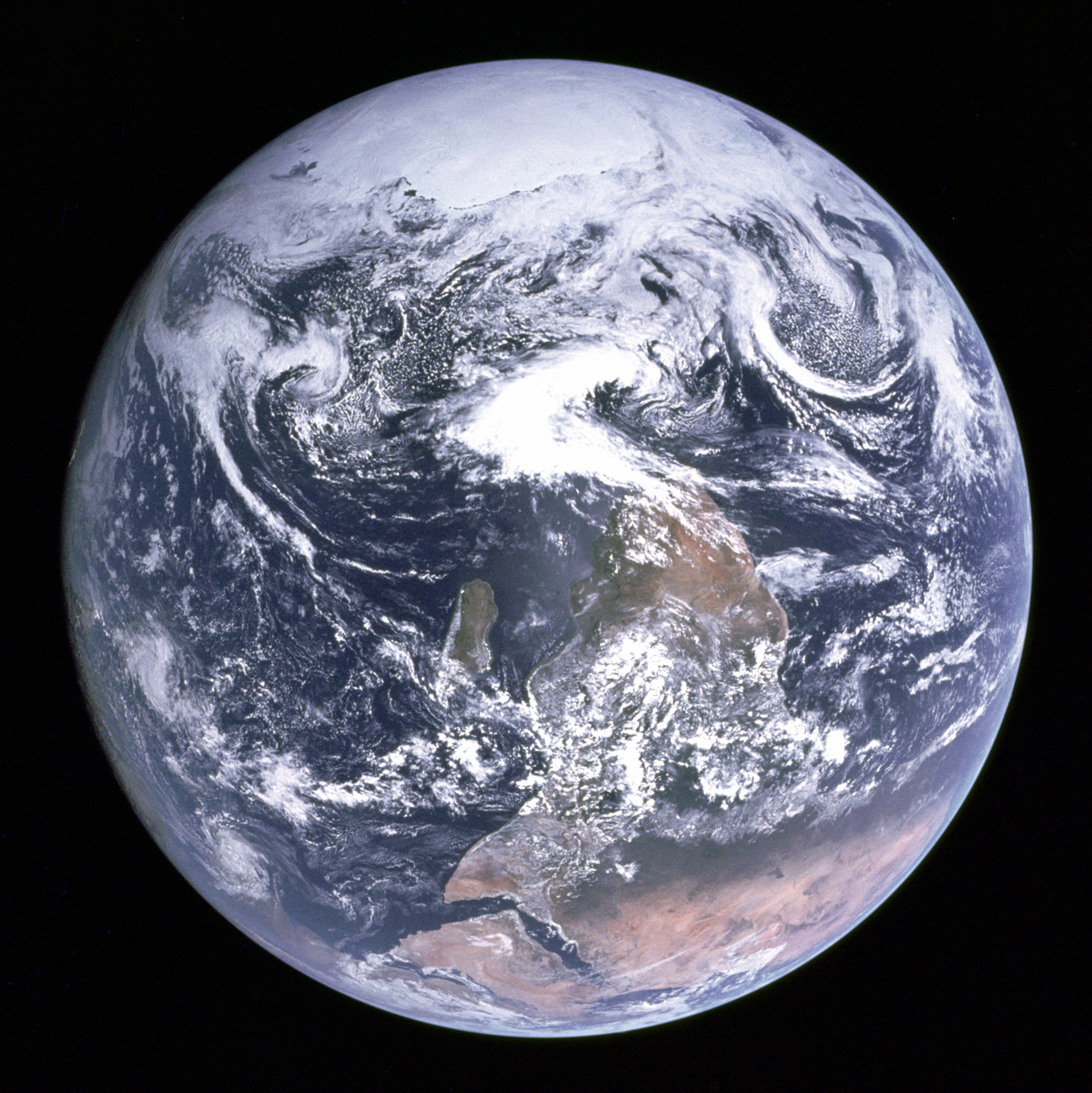
There is also this image, taken through the left-hand command module window of Apollo 4:

602px-AS4-1-410HR.jpg


Perhaps the first US image of the whole Earth, but not widely published.

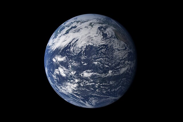
The more I look at real (and well-compiled) pictures of the Earth, the less I think this image should even be given the title of "Blue Marble". Maybe I'm missing out on the high-res version or something, but for something to be a spectacular image it should look great even at fairly low resolutions.

Also, consider that on so many maps Europe is put in the center. Europe has been just as guilty as North America of making their continent look bigger or more important. Heck, I'll bet this is done on every continent.

Well, the Mercator projection will make landforms nearer the poles much larger than ones at the equator (see Greeland being of equal size to Africa, whereas in reality it is far smaller, for example). It's just a matter of cartographic technique.

And of course with a Meridian located in Europe (Greenwich, of course) it does put Europe roughly in the center of the map.

To me, Africa has always appeared in the center of a world map centered on the Greenwich meridian. It is relatively close to the meridian, and it straddles the equator. It is not flanked by considerable landmasses directly to the east or west... so it really stands out at its position on the map.

Perhaps it is appropriate, considering that we all came from Africa. :lol:
 
Yeah, FOV is too great to be taken from a great distance. You can get the same effect in Orbiter by getting closer and increasing FOV.

Far away:
12_01_30_12-50-34_Earth.jpg


Close up:
12_01_30_12-50-22_Earth.jpg
 
Back
Top