You are using an out of date browser. It may not display this or other websites correctly.
You should upgrade or use an alternative browser.
You should upgrade or use an alternative browser.
Humor Random Comments Thread
- Thread starter Tex
- Start date
http://english.aljazeera.net/video/middleeast/2011/03/20113912019839325.html
At about 1:13, they say that if those tanks exploded, everyone within a minimum radius of 15km^2 (seems to be a slight units fail there) would be killed. Are they talking about a massive shockwave, or would it be more like an immense MOAB?
At about 1:13, they say that if those tanks exploded, everyone within a minimum radius of 15km^2 (seems to be a slight units fail there) would be killed. Are they talking about a massive shockwave, or would it be more like an immense MOAB?
I envy people who could tell fonts apart...
For me they're all the same, and arial is as readable as comic sans.
This post is written in one font as far as i'm concerned.
They're letters. What could their shape change?
Speed of reading. Sans serifs are very well suited for aerospace applications and that's why one has GOSTs on typefaces in aircraft. Typewriter fonts evoke fond memories of reloading tape... Serifs are quite handsome for publications. Bitmapped fonts are outright ugly.
Attaching...
Attachments
- Joined
- Feb 6, 2008
- Messages
- 38,965
- Reaction score
- 3,937
- Points
- 203
- Location
- Wolfsburg
- Preferred Pronouns
- Sire
http://english.aljazeera.net/video/middleeast/2011/03/20113912019839325.html
At about 1:13, they say that if those tanks exploded, everyone within a minimum radius of 15km^2 (seems to be a slight units fail there) would be killed. Are they talking about a massive shockwave, or would it be more like an immense MOAB?
Wouldn't bet it that. Oil tanks are a huge danger, especially at that scale, but not comparable to high explosives. For causing a fuel air explosion there, like in a MOAB, you would need to disperse the fuel first, which is pretty hard unless you use a bunker buster bomb. Bombing such depots with conventional bombs usually causes strong fires and secondary explosions by increasing tank pressure of neighboring tanks.
See here for an example how the damage looks like:
[ame="http://en.wikipedia.org/wiki/2005_Hertfordshire_Oil_Storage_Terminal_fire"]Buncefield fire - Wikipedia, the free encyclopedia[/ame]
Last edited:
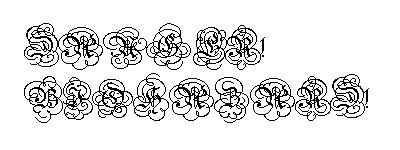
THICKThey're letters. What could their shape change?
SERIFS
ALIASED
NORMAL
JUST PLAIN WRONG
There are plenty of little differences that I guess aren't as noticeable for non-native users of the Roman alphabet. Surely there are differences between Cyrillic characters I couldn't see. Honestly Cyrillic all just looks like dyslexic Greek to me... :shifty:
- Joined
- Jan 7, 2008
- Messages
- 5,814
- Reaction score
- 869
- Points
- 203
- Location
- Earth
- Website
- orbides.org
- Preferred Pronouns
- she/her
What else is there? TTF? That's aBitmapped fonts are outright ugly.
 to decode. Chr? Obsolete as hell.
Bitmap fonts are often the only choice if you don't bind to a specific system.
I guess programming background also had an effect - in IDEs all fonts are fixed-width by definition, making them as good as bitmap ones.
These are not letters. They don't look like themselves. I guess there is a limit of looking-like-letters-nes.Attaching...
May be. Thick ones stand out, for the rest i can see the difference if i make an effort, but once i start reading a text they all vanish with the letters themselves.THICK
SERIFS
ALIASED
NORMAL
JUST PLAIN WRONG
There are plenty of little differences that I guess aren't as noticeable for non-native users of the Roman alphabet. Surely there are differences between Cyrillic characters I couldn't see.
Greek it was, borrowed and improved, as the legend says.Honestly Cyrillic all just looks like dyslexic Greek to me... :shifty:
Lucky you then.I've got it running in the background as I write, and there's no evidence of problems yet. Aside from the "while(1)" deal it compiled without problem.
Probably an implementation-specific issue. On my setup it's not even maxing out one CPU, and gnome-terminal is taking up more CPU time than the Java process.
Nothing froze in several minutes of run time. The only reason the program ever stopped was that I got bored and hit Ctrl-C.
I/O in general takes insane amounts of time. And even that proceeds at lightning speeds compared to the reactions of the meatbag sitting at the keyboard.
") Trying to debug my atari emulator on school computers can be a pain. I don't currently limit the speed, so if I'm printing multiple lines every operation, it eventually freezes and/or crashes the IDE. No such problems on my laptop though.
Trying to debug my atari emulator on school computers can be a pain. I don't currently limit the speed, so if I'm printing multiple lines every operation, it eventually freezes and/or crashes the IDE. No such problems on my laptop though.Linguofreak
Well-known member
Lucky you then.
Ah. You're using an IDE. I'm using a text editor and a terminal.
What else is there? TTF? That's a
Bitmap fonts are often the only choice if you don't bind to a specific system.
Have a break Artlav, have a kit kat
Would FreeType library to decode TTF be a viable option?
Re: chocolate. Chocolate is evil - it clogs blood vessels and damages teeth... There is one redeeming quality though - women like it, present selection becomes a no-brainer.
Re: chocolate. Chocolate is evil - it clogs blood vessels and damages teeth... There is one redeeming quality though - women like it, present selection becomes a no-brainer.
- Joined
- Jan 7, 2008
- Messages
- 5,814
- Reaction score
- 869
- Points
- 203
- Location
- Earth
- Website
- orbides.org
- Preferred Pronouns
- she/her
Guess the gadget:

In Soviet russia... calculators don't do pie:
http://orbides.1gb.ru/calc-gal.php?lng=eng
In Soviet russia... calculators don't do pie:
http://orbides.1gb.ru/calc-gal.php?lng=eng
HAL9001
super-ninja-orbinaut
Chuck norris burned a game of 7.6 GB on 4.7 GB DVD
I can burn a 9GB-game on a 4.7GB-DVD - if I may use Zip.
Chuck norris burned a game of 7.6 GB on 4.7 GB DVD
I can burn a 9GB-game on a 4.7GB-DVD - if I may use Zip.
:rofl:HAHAHAHAH EPIC
Linguofreak
Well-known member
In Soviet russia... calculators don't do pie:
Eh... There are a quite a number of calculators that don't do pi in Unsoviet America too...
I can burn a 9GB-game on a 4.7GB-DVD - if I may use Zip.
hahahahahaha :LOL!:
But i just find out that Chuck norris is not using Zip..
Similar threads
- Replies
- 7
- Views
- 3K
- Replies
- 34
- Views
- 9K