News Graphic designers try to redesign the NASA insignia

perseus

Addon Developer
Addon Developer
Joined
May 31, 2008
Messages
316
Reaction score
1
Points
18
Well, looks like any improvement the original, it is inexplicable with how beautiful are the pacht of mission, the last test looks like a pen that did not work well hehe,
NASA3__1272033112_1295.jpg


Sure here and other people would have Better ideas.
:p

But I still like the originally.
images

:10sign:
 
Last edited:

statickid

CatDog from Deimos
Donator
Joined
Nov 23, 2008
Messages
1,683
Reaction score
4
Points
38
This kind of attitude ... <snip>...

...claiming they're ugly for no other reason than you think they look ugly.

As for your other justification:

I think this is just nonsense, but do you care to elaborate? The meatball logo was drawn in the 1950s, before there was any notable space industry to take inspiration from. As for the aviation industry, I am clueless.

it seems clear you have classified me as some pedestrian armchair cynic pretending that negative poo-slingin' makes me a self-qualified expert.

The academic discovery of the subjectivity of art is both the the ultimate blessing and curse of contemporary art philosophy. It at once allows freedom of creativity and expression through art, while also empowering the unwashed masses with an inarguably correct voice of opinion. It is difficult for most to fathom how a formal education in a "fully subjective" field can produce "experts of opinion", so to speak.

You’ve stated that I claim the logos are ugly for no other reason than that I think thy look ugly, and then completely ignore the reasons I have given for not liking them.

I will elaborate on my other justification with a response to your comment.

I’ll repaste my original text here.

And possibly most significantly, the designs do nothing to acknowledge the context and rich history of logo design within the aerospace and spaceflight industry. This last reason is probably responsible for the general negative reception to these mock-ups.

you said:
The meatball logo was drawn in the 1950s, before there was any notable space industry to take inspiration from. As for the aviation industry, I am clueless.

I think what you are trying to say is that the meatball logo is loved but was ITSELF created in a ideological vacuum, so in turn, there is nothing wrong with creating logos from thin air for NASA.

I am trying to say that MY GUESS (notice I did say “probably”) as for why a bunch of space enthusiasts aren’t swooning over these speculative logos despite their thoughtfulness, symbolism, and the qualifications of their respective designers is that the proposed logos don’t fit in with the conventions set for logo design in the industry.

One of the principle differences between the meatball logo and the logos in the article is about 50-60 years. There may not have been a notable space industry in the 1950s but I can assure you the meatball designers did not fashion the meatball logo purely on whim. I honestly haven’t looked into this, but my GUESS would be that it probably drew its art direction from ideas about spaceflight at that time. Since space flight was in the making, most of the ideas about it would most likely have been in the realm of science fiction (this idea intrigues me and I will look into it). Why do the NASA logos look like they belong on the cheesy old 70’s sci-fi TV shows? I would venture to say that science fiction is the real workhorse PR campaign for spaceflight. TV shows and movies capture the imagination of the audience. They show us how the impossible is effortlessly accomplished by the magic of undiscovered technologies. They show us how our fragile chemical rockets are the baby steps we need to take before being able to hop skip and jump through the universe like it was a playground. We can see how the humans will outlive the mortality of our planet, and that we are not a transient smudge but citizens and explorers of the universe.

If you want examples of aerospace and spaceflight logos just search for those terms. You will see a range of bold, lightweight and highly visible logos. There are sweeping chevrons, diminishing texts, and tiny rockets underlining or bursting through the text with their shockwaves and exhaust plumes as viewed from the ground observer as lines punctuated by the tiny geometric spacecraft and airspace vehicles.

Aerospace and spaceflight logos, in my mind, seem to suggest the power and speed of the machines they emblazon. The mission patches are richly saturated with symbolism taken from legends, heroes, gods, and explorers throughout history. Some take cues from military and navy type insignias. Above all, however, the mission patches are very exciting to look at.

Another non-coincidental quality these logos tend to share is their ability to fit neatly on the side of a fiery cylinder with the inferno of hell blazing out the bottom.

For these reasons to start, I claim the inadequacy held by the logos proposed by the graphic designers in the newspaper article. I can pick apart the individual shortcomings each possess if you like, but rest assured I would also be fair to point out their individual strengths as well. For example, since I have mercilessly bashed the hubble star field and unispired bauhaus logos I'll summarize the main reasons why I personally don't like them.

The hubble star field is too tranquil and stagnant. It is too specific to adequately portray the multitude of achievements NASA holds in it's pocket.

The bauhaus rocketships look like galvanized jungle gym toys bolted firmly to the ground.

Neither of them excite me or capture the imagination sparked by spaceflight.

The lego block and mars spoof are leagues ahead of either in this respect.

As they are, I don’t like them, and i CAN tell you why I don’t like them.

If NASA is so enamored by one of these logos that it adopts one, I'll eat my hat! :tiphat:
 

PhantomCruiser

Wanderer
Moderator
Tutorial Publisher
Joined
Jan 23, 2009
Messages
5,603
Reaction score
167
Points
153
Location
Cleveland
When someone puts ink (or paint, watercolor, crayon, whatevs) to a medium and calls it "art", well then, it's art. I don't have to like it, nor do I have to explain why I don't like it. If I think it's ugly and don't want to buy it and the artist begins a long rant about how awesome it is, I still don't have to write a check. It's ugly, I'm not buying it and I don't want it in my house.

Same or similar goes with music, interpretive dance, sculpture, automotive design, etc...

The NASA meatball is all it's aged glory, to me is a symbol that mankind is on a constant quest for knowledge, and by reaching for the stars we learn more of what it means to be human. It's as recognizible to me as the Coca-Cola ribbon or the Nike swoosh.

And isn't that what a logo is supposed to represent? Instant familiarity?
 

Unstung

Active member
Joined
Dec 10, 2008
Messages
1,712
Reaction score
3
Points
38
Location
Milky Way
it seems clear you have classified me as some pedestrian armchair cynic pretending that negative poo-slingin' makes me a self-qualified expert.

As I stated, that's pretty much the feeling of the thread that compelled me to make my post in the first place. While you bring up things you don't enjoy about the logos, I was looking for more objective reasons* to dislike them. That does sound stupid, but I've learned there are specific techniques I understand in photography that can be applied to painting and film**. Being able to see the application of these techniques, whether coincidental or intended, can arguably lead to a deeper appreciation of art which is what I meant when I wrote that "t took me four years... to know why I like or hate a particular photograph".

Since graphic design, including logo creation, is an art form, there are potentially techniques I simply don't know about that are present which one can appreciate. It seems that what drives the simplicity of logos nowadays is the variety of media they have to be displayed on and be recognized instantly. That may lessen the ability to use any techniques.

As long as you appreciate good symbolism (that's definitely subjective) in spaceflight logos that's a perfectly fine reason for whether or not to like them. I find the Apollo 17 patch my favorite and very inspiring, but it may be too complex for a scalable logo nowadays.

The meatball logo manages to fit contemporary hypersonic wing design (chevron), a constellation (stars), and an orbiting spacecraft into a very identifiable, simple design. That's an impressive feat. And like understanding the Apollo 17 patch's symbolism and artistic design techniques, knowing the meatball's symbolism makes me appreciate it much more.


*Basically, reasons based on actual techniques that have been employed either poorly or superbly.

**I've considered pasting an analysis of one of my own photographs as an example of several techniques in practice, but I think it will make me appear like a massive pretentious erudite. That is assuming I already don't appear like one.


In response to PhantomCrusier: while what you wrote is true, I was disheartened by the overwhelmingly negative bandwagon response to the five logos. The lack of reasons for the negative response made me feel compelled to defend the logos.
 
Last edited:

PhantomCruiser

Wanderer
Moderator
Tutorial Publisher
Joined
Jan 23, 2009
Messages
5,603
Reaction score
167
Points
153
Location
Cleveland
In response to PhantomCrusier: while what you wrote is true, I was disheartened by the overwhelmingly negative bandwagon response to the five logos. The lack of reasons for the negative response made me feel compelled to defend the logos.

I dig it. But messing with the NASA logo to a group of spaceflight enthusiasts is like trying to resurrect New Coke.

As far as the logos go, none of them really captured my fancy. The worm is kind of retro, but it to me would be a short term gimmick. page 4 reminded me of 80's video game graphics (Atari v Commodore) and #5 made me throw up a little bit.
The other wasn't all that different from what we have now, just the red airfoil missing removes too much I think.

How about
61eXeR6sBQL._SX355_.jpg
 

Unstung

Active member
Joined
Dec 10, 2008
Messages
1,712
Reaction score
3
Points
38
Location
Milky Way
I want to add this comment before I forget.

When someone puts ink (or paint, watercolor, crayon, whatevs) to a medium and calls it "art", well then, it's art. I don't have to like it, nor do I have to explain why I don't like it. If I think it's ugly and don't want to buy it and the artist begins a long rant about how awesome it is, I still don't have to write a check. It's ugly, I'm not buying it and I don't want it in my house.
I've thought about this and it's probably the reason why I became offended in the first place. I've definitely been on the other side of this situation and can explain the feeling from my experience. This is from my perspective as a hobbyist.

Imagine that you've worked on some visual artwork for over a hundred hours. While you appreciate the final outcome, it really absorbed your free time in the past month which could have been used to do something you find more relaxing. Nonetheless, you enjoy the final outcome and seeing how much you've progressed. It's nice to produce something tangible in your spare time. You're proud of your work and share it.

Unfortunately it's hard to enjoy something you've worked on that provides no physical enjoyment, so you hope that you can get some feedback out there. After waiting a while, all you get are a few reactions. There's a decent amount of negative, hateful, and unjustified responses in there. Remarks like "this sucks" are the worst and yet common. Things like "nice work!" aren't helpful either. For the time spent using everything you've learned, maybe somebody will provide constructive criticism that can be used to improve your future projects with. Some other recognition through people following your work would be nice too, but that never comes. For all you know, all the handful of your viewers could've just glanced at your work. So it's pretty difficult to justify spending huge amounts of time on something that is practically only for yourself to look at occasionally.

And that's why my last video was released over nine months ago (which was designed to require much fewer than 100 hours to make). I want to shift to making 3D animations, but the time required to learn and practice that skill for such a low payoff isn't worth it. I find photography to be the most gratifying hobby because a shoot and editing takes a few hours at the most and requires me to get off my ass. I haven't even bothered uploading several good shots because I don't feel that I need to share them (despite usually being identifying). I can also physically print photos and hang them in my room. Making small graphics can take a comparable amount of time to photography, but that requires me to work only at the computer. Videos take dozens of hours and are the hardest to appreciate.

If you're making an income from art like these studios, you're risking more than your free time.

In summary: spending a lot of time on something that's functionally useless and gets no appreciation can easily feel like a complete waste.
 
Last edited:

PhantomCruiser

Wanderer
Moderator
Tutorial Publisher
Joined
Jan 23, 2009
Messages
5,603
Reaction score
167
Points
153
Location
Cleveland
It's not a waste if it is something that you enjoy.

Art for the sake of art is one thing. I don't have to like it, it's the artist who has to like it.

If I buy a piece from a street artist (and I have, New Orleans 2004, and a few since then) I need to like it. Or it has to interest me in some way. On my wall I've got a 19*22 photograph of Battleship Tennessee (grabbed it for free but had to pay dearly to get it mounted). I've also got a painting from a local artist here who painted the train depot here from back in it's heyday (drank a few beers with the artist, got a picture with him and he signed one of his lithographs and gave it to me).

If I commission something, I need to really like it. If I don't "get" it, then I don't get it; and no amount of explaining will help. Kind of like how a joke loses all meaning and comedic value if you've got to explain the joke to somebody.

For NASA to change their logo. It's got to be something really awesome. And I just don't think that these fit the bill.
 

jedidia

shoemaker without legs
Addon Developer
Joined
Mar 19, 2008
Messages
10,861
Reaction score
2,125
Points
203
Location
between the planets
It is art and there are no rigid rules of logo design.

Actually, there are pretty rigid rules on logo design. Designing a logo might take a lot of artistry, but a logo is a very much functional piece of art. It has to be able to fulfil that function. Logo and corporate identity design is a discipline that might as well be called "graphical engineering". Yes, there's a lot of art and creativity involved, and one might or might not like the result... But there's still a few very specific practical functions that the result has to be able to perform, whether you like the design or not.

Some of these suggestions inexplicably fail at performing that function. And I really mean "inexplicably". I don't get how this can happen, except for completely inexpierienced people, who might have a lot of creativity but not a clear idea about what function a Logo has to perform. This description doesn't seem to fit for the authors here, so...
what the hell happened?
 

perseus

Addon Developer
Addon Developer
Joined
May 31, 2008
Messages
316
Reaction score
1
Points
18
If you're making an income from art like these studios, you're risking more than your free time.

In summary: spending a lot of time on something that's functionally useless and gets no appreciation can easily feel like a complete waste.


That fantastic discussion, we entered the complex, reflections, subjective and objective, the art world, and to be subjective, legitimate gives rise to all sorts of opinions, that only time, when it has formed a concessive true of opinion in a certain direction, is respected by valuation of the opinion of a majority. Now with historical perspectives. But it is always a source of exploration concept, resolution of communication of ideas, and especially intellectual enjoyment of its author. this is one of the reasons main if made ​​with conviction.
 
Last edited:

Urwumpe

Not funny anymore
Addon Developer
Donator
Joined
Feb 6, 2008
Messages
37,604
Reaction score
2,324
Points
203
Location
Wolfsburg
Preferred Pronouns
Sire
But there's still a few very specific practical functions that the result has to be able to perform, whether you like the design or not.

Especially as example there:

The logo has to look good in various forms with only minimal alternations. On a letter header as well as in the footer of a Powerpoint Slide, in a 4 color print for job offers or on a large billboard on the VAB. Or on the fuselage of a space vehicle.

Usually, you have multiple sizes of the logo to ensure that the quality is reduced in a graceful way to ensure it still looks good (instead of depending on the quality of the algorithm).

As you can see - that's no easy task - and almost all new logos presented suck badly at it (except the one from Interstellar or Lorus attempts).

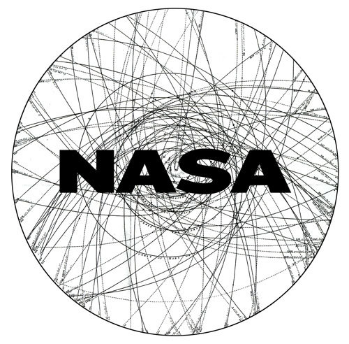
I think the one of the comet orbits has still the best chances to be turned into a great logo, if the level of detail could be reduced far enough to still look good in 1.5 cm size.
 

jedidia

shoemaker without legs
Addon Developer
Joined
Mar 19, 2008
Messages
10,861
Reaction score
2,125
Points
203
Location
between the planets
Usually, you have multiple sizes of the logo to ensure that the quality is reduced in a graceful way to ensure it still looks good (instead of depending on the quality of the algorithm).

Which is why Logos are prepared as vector data, not pixel data. Especially that white on black example in the suggestions horrified me in that regard...
 
Top