You are using an out of date browser. It may not display this or other websites correctly.
You should upgrade or use an alternative browser.
You should upgrade or use an alternative browser.
Colour vision test
- Thread starter Turbinator
- Start date
diogom
Well-known member
- Joined
- Aug 2, 2010
- Messages
- 1,556
- Reaction score
- 913
- Points
- 128
- Website
- github.com
- Preferred Pronouns
- he/him
Not colourblind, so it means I won't give up on being a pilot. ")
Pinguinboy
50.000 years old lifeform
- Joined
- Aug 12, 2008
- Messages
- 219
- Reaction score
- 0
- Points
- 0
- Location
- Mare Infinitus; 55 Cancri
- Website
- www.facebook.com
61.9 9.2 6.7 11.4 1.38 1.00
According to this test result you are not colorblind.
severity
TSPenguin
The Seeker
- Joined
- Jan 27, 2008
- Messages
- 4,073
- Reaction score
- 4
- Points
- 63
According to this test result you are not colorblind.
severity
Where it says severity, there would be a bar showing how bad you did at the test.
Don't let web designers confuse you!

mine made a nice circular path... guess i'm not colorblind then... well, i already knew that - but it should have been easier if i had done the test with my big computer, instead of my laptop... much better contrast on the monitor...
i wonder how valid is a test done like this... what if i had my gamma settings all messed up?
i wonder how valid is a test done like this... what if i had my gamma settings all messed up?
Turbinator
New member
3 times in a row..."severity" bar always between 1/2 and 3/4.
According to this test result I have a deutan color vision defect.
Red-Green spectrum?
Here is a good example for me, take a look at this flag of Italy:
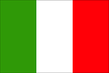
You can clearly see the Green, White and Red. So can I.
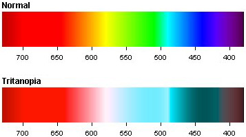
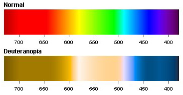
Now take a look at this flag of Italy:

It takes an effort to notice difference between green an red, at first glance they could both be red. But when it sits next to the picture of the above flag, or to any picture that has a lot of red, or a lot of green in it, it easy to see the green, and the red. It's just that I have to maintain an effort to notice the difference. So, the closer the red and the green spectrum are to each other, the harder it becomes to distinguish. Other colours I see normally.
Last edited:
- Joined
- May 30, 2008
- Messages
- 5,580
- Reaction score
- 2
- Points
- 0
Doesn't help that if you "pass" the test it doesn't show any bar at all, so it's kind of hard to tell what that section is used for.Where it says severity, there would be a bar showing how bad you did at the test.
Don't let web designers confuse you!
But you still have them fairly close to each other in hue. If you were to randomly distribute them, I think you would find a much lower score.I have made the test again, backwards (ordering blue to the right and purple on the left). I only got a slight protan color vision defect. I think I can't make it worse...:beathead:
- Joined
- Jan 7, 2008
- Messages
- 5,814
- Reaction score
- 869
- Points
- 203
- Location
- Earth
- Website
- orbides.org
- Preferred Pronouns
- she/her
I wonder, how much difference in colours do you see between a monitor and natural (non-printed) colours? A real, dyed flag and a flag drawn across the whole monitor would look much different?But when it sits next to the picture of the above flag, or to any picture that has a lot of red, or a lot of green in it, it easy to see the green, and the red. It's just that I have to maintain an effort to notice the difference. So, the closer the red and the green spectrum are to each other, the harder it becomes to distinguish. Other colours I see normally.
What way does this test work?
- Joined
- Oct 30, 2009
- Messages
- 14,019
- Reaction score
- 4
- Points
- 0
I just did the test with several different color settings of my CRT monitor, i.e. 5500K, 6500K, 9300K, manual R-95% G-95% B-95%, and different brightness and contrast settings, and the result was always the same:i wonder how valid is a test done like this... what if i had my gamma settings all messed up?
[table="head;width=350"]
Angle
|Major
|Minor
|TES
|S-index
|C-index
61.9
|9.2
|6.7
|11.4
|1.38
|1.00
[/table]Though for 5500K color and low brightness and contrast it took me much longer to arrange them.
Next, I'll test it on my laptop's LCD, which I know isn't designed much for editing/making graphics (once I edited a picture to enhance colors, and when I checked it next on CRT, the sky was violet, though on laptop it still was blue
 ).
).I apparently have this one:
...Which makes sense, since people keep giving me blank white pages and expecting me to read them. Apparently they have yellow-beige text on them.
Who the heck puts yellow text on a white page, anyway??
...Which makes sense, since people keep giving me blank white pages and expecting me to read them. Apparently they have yellow-beige text on them.
Who the heck puts yellow text on a white page, anyway??
- Joined
- Jan 7, 2008
- Messages
- 5,814
- Reaction score
- 869
- Points
- 203
- Location
- Earth
- Website
- orbides.org
- Preferred Pronouns
- she/her
...how common is colour blindness anyway?
If affected people here don't mind me asking, how did you learn about the problem, and how long you didn't know about it?
If affected people here don't mind me asking, how did you learn about the problem, and how long you didn't know about it?
Turbinator
New member
Who the heck puts yellow text on a white page, anyway??
It looks nice actually.
What I don't like is when you are given a map, where different colours represent various variables, where, do to their choice of colour, all the colours look like a different shade of green to me
 History books are famous for this. I always had trouble reading colour coded history maps.
Oh, there is one thing I can do that normal colour vision people can't. Military camouflage stands out like a sore to me. Specially those green tent like covers they use on tanks, artillery, and on top of tents. It's like a giant "we are here" sign above their heads. :lol:
My spectrum. Although it is not as extreme as in this example.
.
Last edited:
Hah, that's why I'm glad when we have to use ancient textbooks that only use the primary colours, and then different patterns of dots and dashes instead of the big blue mess I see in most newer books.What I don't like is when you are given a map, where different colours represent various variables, where, do to their choice of colour, all the colours look like a different shade of green to me
Turbinator
New member
What do you see when you look at this image?

It causes big, huge, contrast "noise" along the border of the red and blue colours to me. The border is sharper than a knife. There is a thick line (about 1mm perceived, thicker if I wear glasses instead of contacts) of pure noise along the border of the two colours. As a matter of fact, it game me a nice, weird, headache now.
.
Last edited:
HarvesteR
Active member
- Joined
- Apr 22, 2008
- Messages
- 387
- Reaction score
- 37
- Points
- 28
I got a pretty normal result...
BTW, I've found that it's impossible to get 'Angle' to a round 62.0... Even if you get the order totally right, you'll always be at 61.9... there must be some rounding errors there somewhere...
Cheers
BTW, I've found that it's impossible to get 'Angle' to a round 62.0... Even if you get the order totally right, you'll always be at 61.9... there must be some rounding errors there somewhere...
Cheers
- Joined
- Nov 4, 2009
- Messages
- 788
- Reaction score
- 4
- Points
- 33
[table="head;width=350"]
Not colorblind, as I always assumed. It was pretty tricky at one point though
Angle
|Major
|Minor
|TES
|S-index
|C-index
61.9
|9.2
|6.7
|11.4
|1.38
|1.00
[/table]Not colorblind, as I always assumed. It was pretty tricky at one point though
61.9 9.2 6.7 11.4 1.38 1.00
Similar threads
- Replies
- 7
- Views
- 4K